|
Thank you Ms. Sudkamp for helping me believe that even I can make beautiful artwork, and for being the most chill teacher ever. You made me actually consider taking more art courses. All throughout elementary and middle school it was how you compare to others, you made it how are you beating your previous self. Thanks again for a great semester.
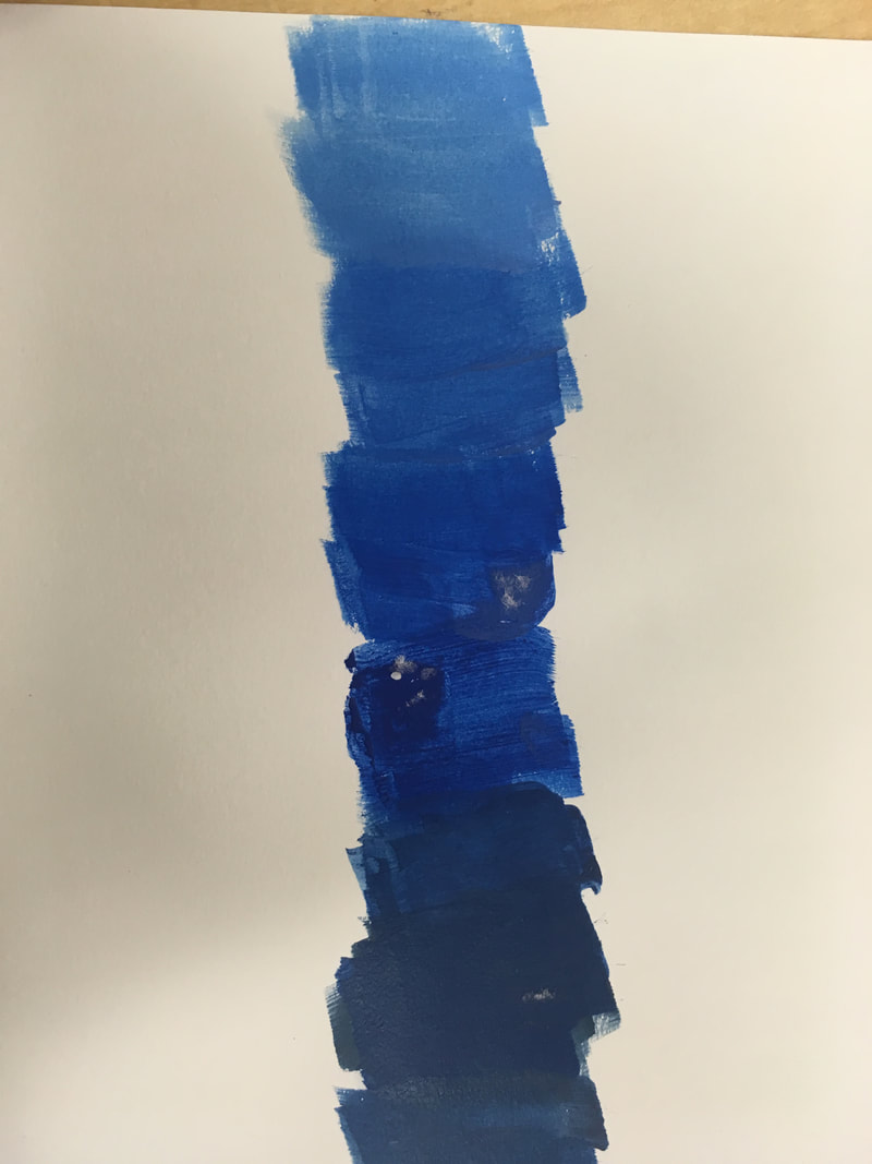
1. The art criticism process follows four simple steps; first plainly describe what you see with detail. Second analyze the work, explain the different elements (ex. Color, value, texture, emphasis). Third interpret the meaning of the artwork (ex. mood, ideas being represent, story). Finally judge the artwork with supporting evidence (ex. What do you think of the work)  This is an acrylic painting of a sunset over a dark lake on a cloudy day. This specific piece of artwork uses a couple of warm and cool colors, with the dark colors around the sun shows emphasis on it. I think the meaning of this painting is peace of mind, a sunset on a vacation. This is a good piece of artwork, but could have been better if I let the clouds color blend.
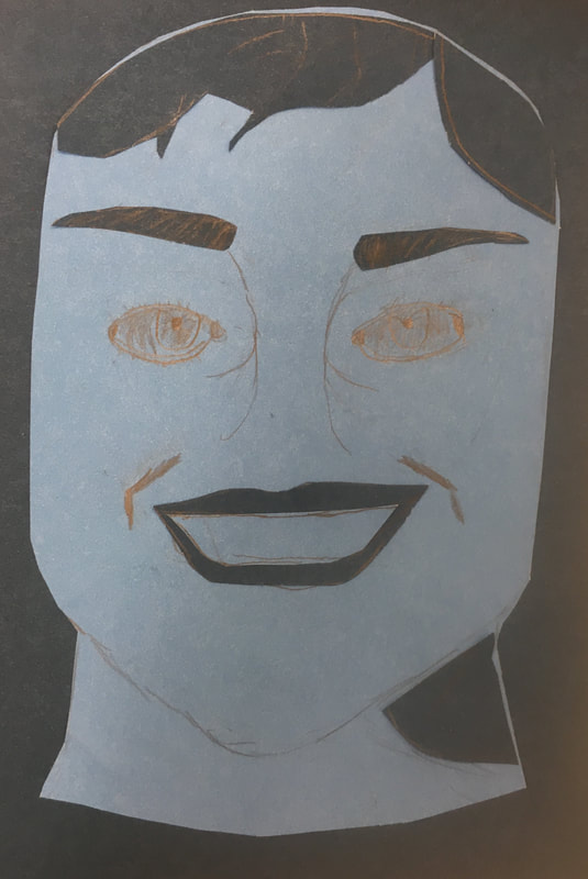 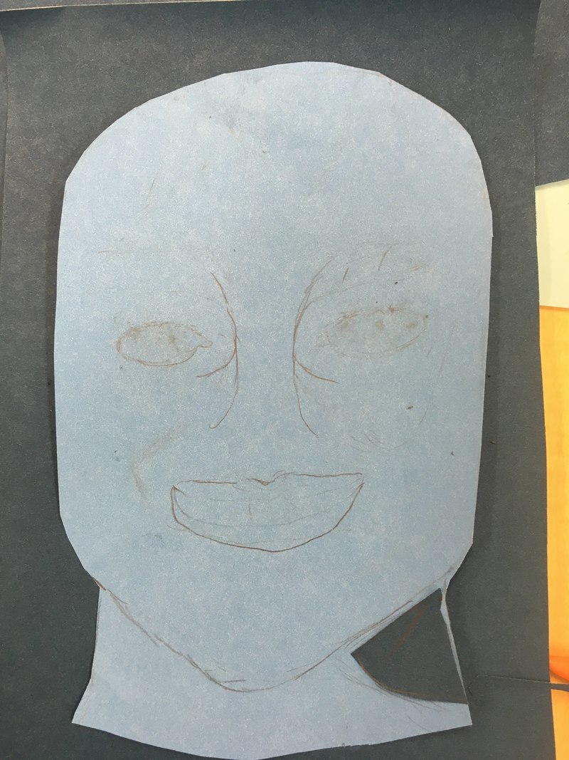 1. I did a portrait of my little brother tanner, he is nine years old and in third grade.
2. The medium I chose to use was a mix of colored paper and pencil. 3. First I had to think of who would be my subject, then find a good picture of them. Second I had to decide on what medium I should use. After that I had to cut out the shape of my brothers head, and find the simple shape of his face. Finally I cut out the darker spots of his face, but sadly I was cut short and forced to pencil in some of his facial structures to finish slightly. 4. The idea of this portrait was great, if I were to do this project I would use more shades of color. 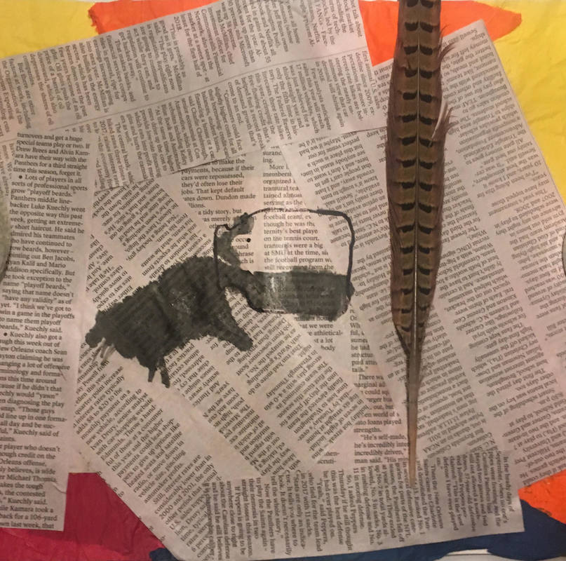 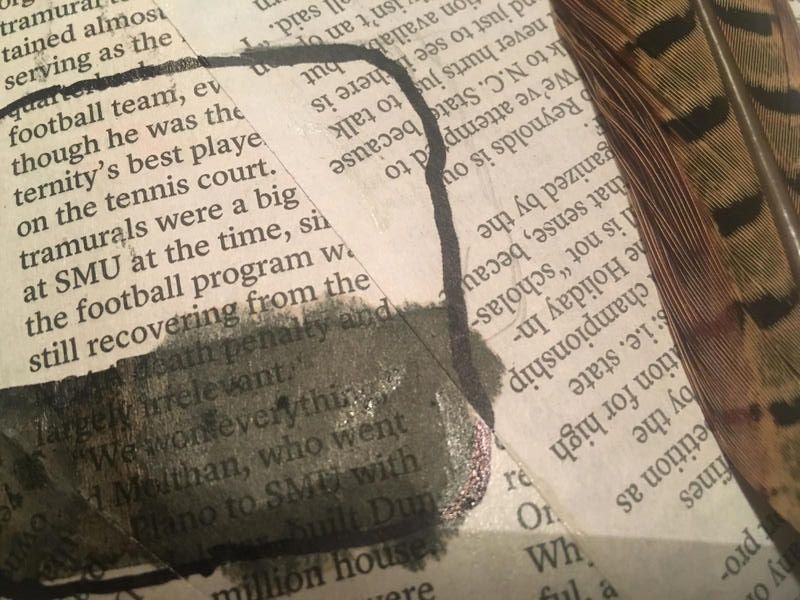 1)I used 5 different mediums ranging from tissue paper to a quill. First was the layer of red, orange, and blue tissue paper glued down for a colorful background. Second was the newspaper glued down in different directions. After that was the sharpie ink container which was sketched lightly then went over it with sharpie. Then I used a straw, and slowly dripped ink onto the newspaper to make it look like a ink spill. Finally I found an old quill that my dad let me have and I glued it down onto the paper.
2) My word was mistake, I portrayed it by making an ink spill on newspaper. 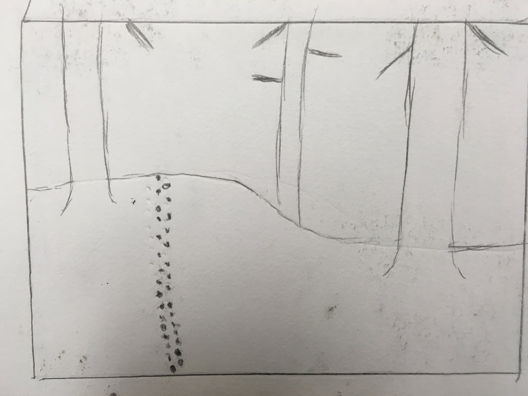 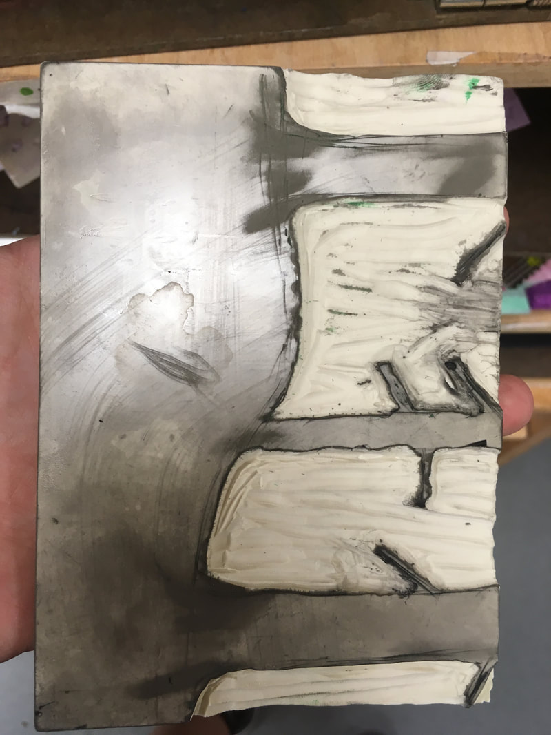 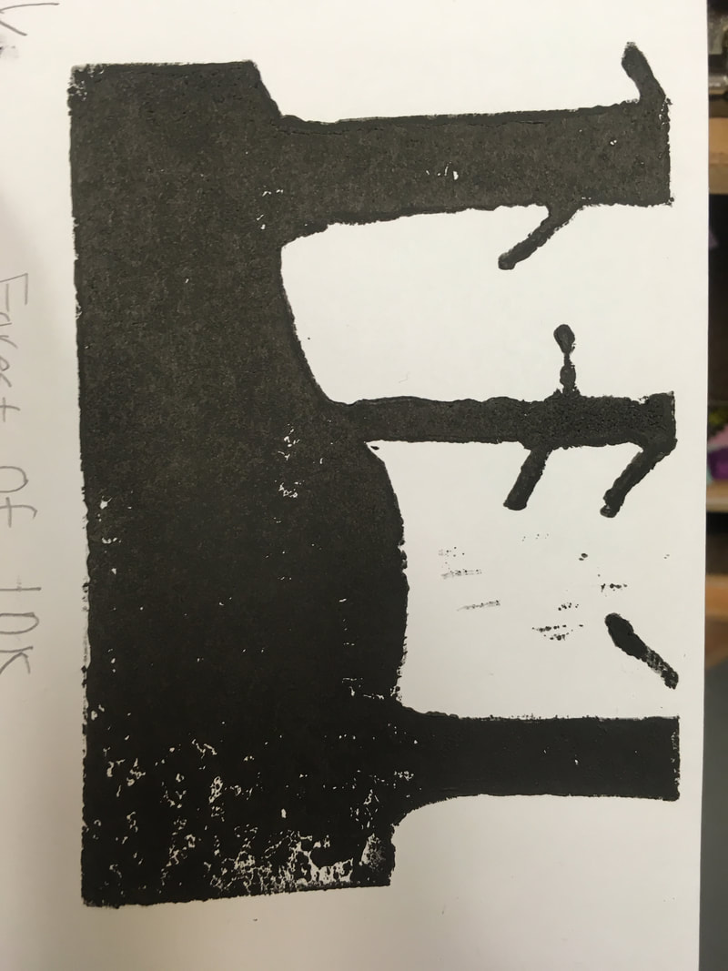 1) The trees were supposed to look more like the sketch but it didn't work very well, if it had worked it would it would have look like lines going different directions to make the design.
2) My piece is successful in the way that the trees did look good on the paper. If I were to this project again I would have made a different design that reflected "line" better. If I were to do it again I would have done a much more complicated design, because although I like the simple look, I would want to do something a little harder. 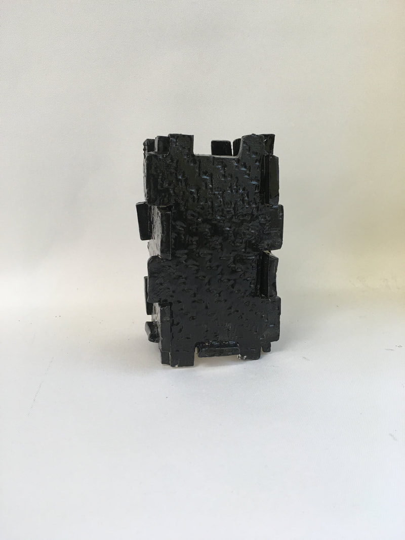 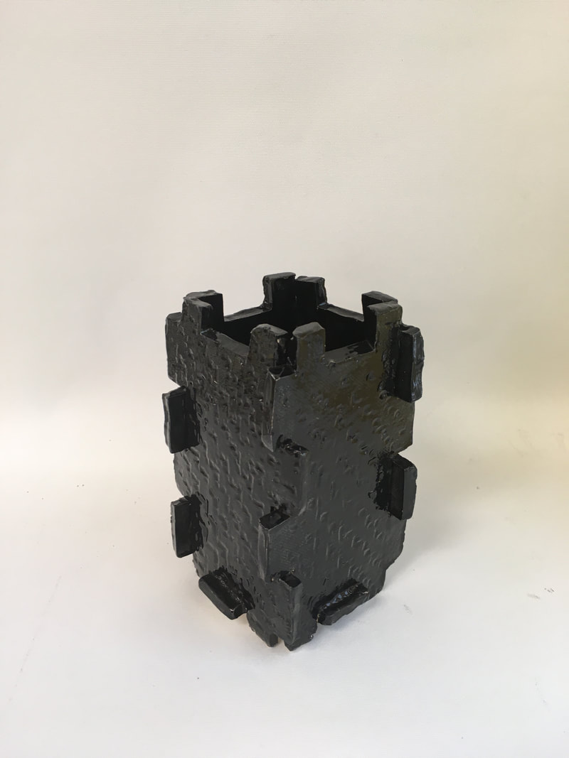 1) Since my in progress blog I have put the pieces together, and fired it in the kiln. Once out of the kiln I glazed it with a very dark black glaze. Finally I put it into the kiln for one last firing and then I was finished.
2) I like how the puzzle pieces have aesthetic look, I also like how the design on the piece turned out. 3) If I were to do this project again I would have added much more color rather than just the completely black glaze. 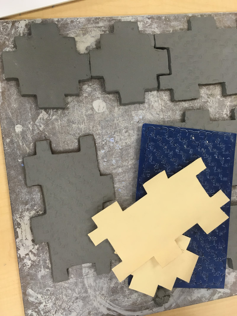 1)With my piece I plan to make a box of interlocking puzzle pieces. I plan to finish it by only connecting the bottom piece so it doesn’t fall off. Finally I plan to give it a little texture but not the most complicated texture because it already has a good design.2)What I found difficult was getting the pieces to be perfectly interlocking. They have to be perfectly shaped.
3) I found putting texture on to be pretty successful. 4) I had to choose a design, then sketch it out. Make template then I had to carve out the pieces I needed. After that I had to put texture on it so it wouldn’t be so plain. 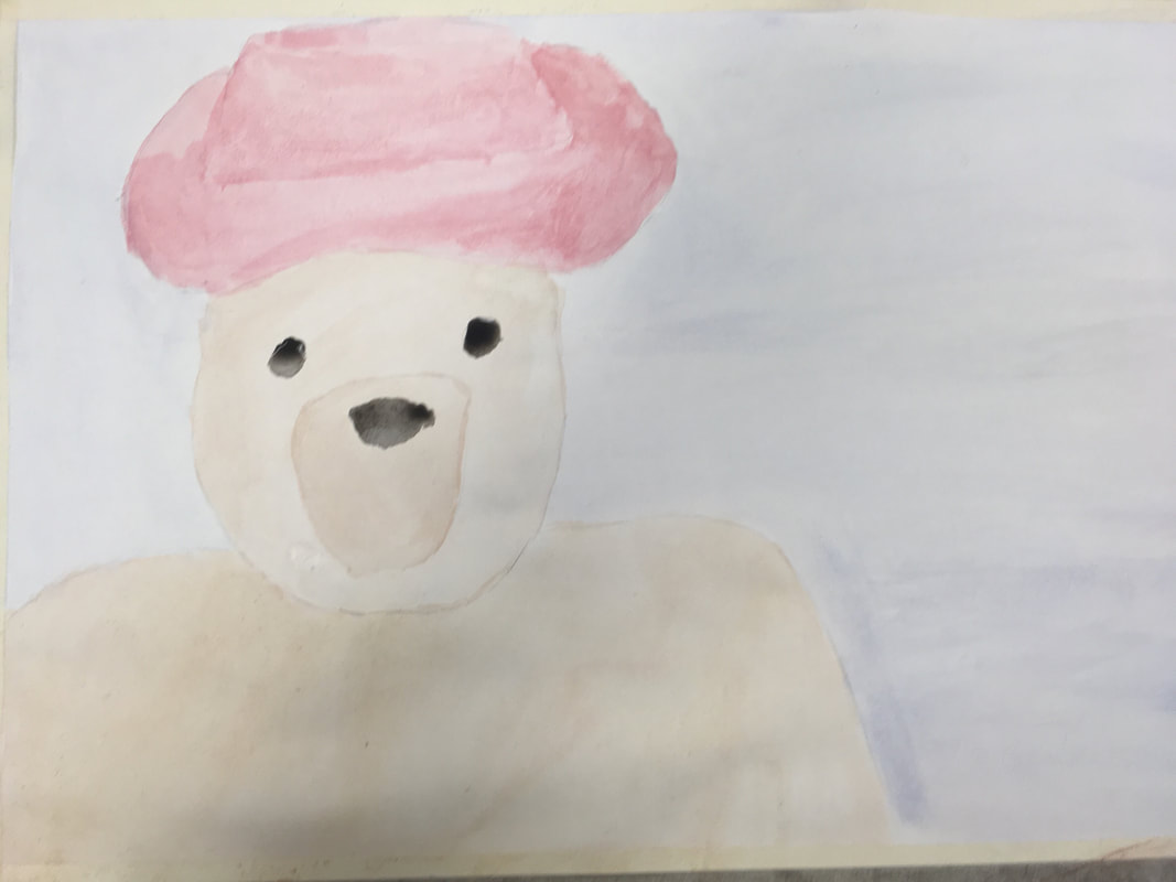
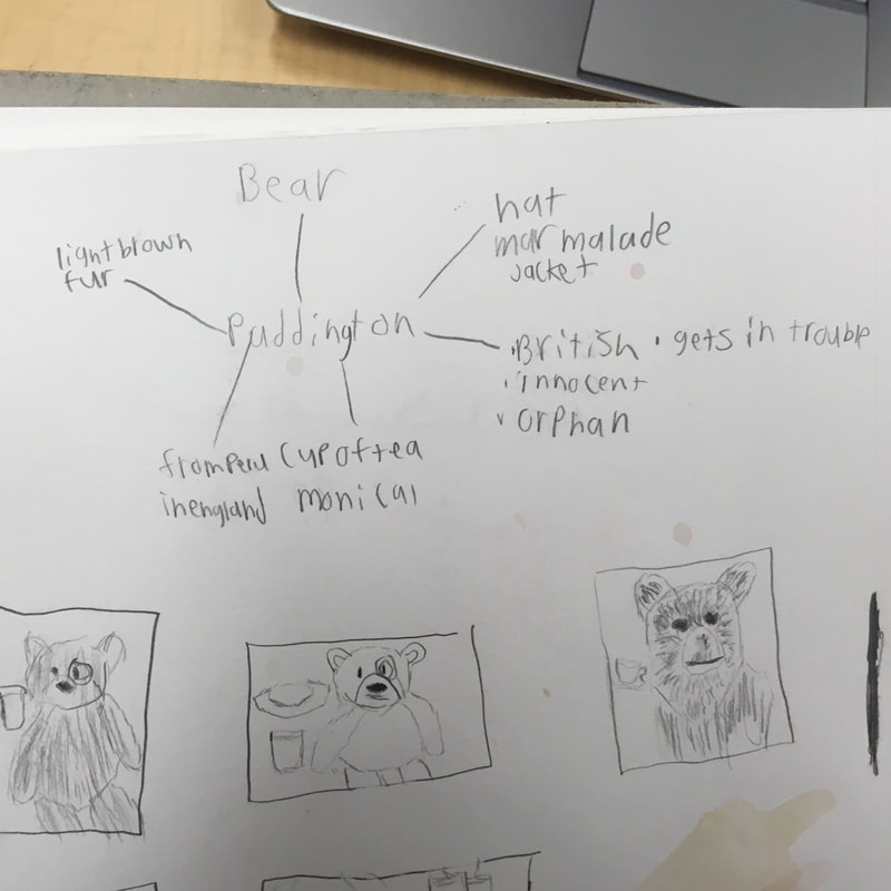
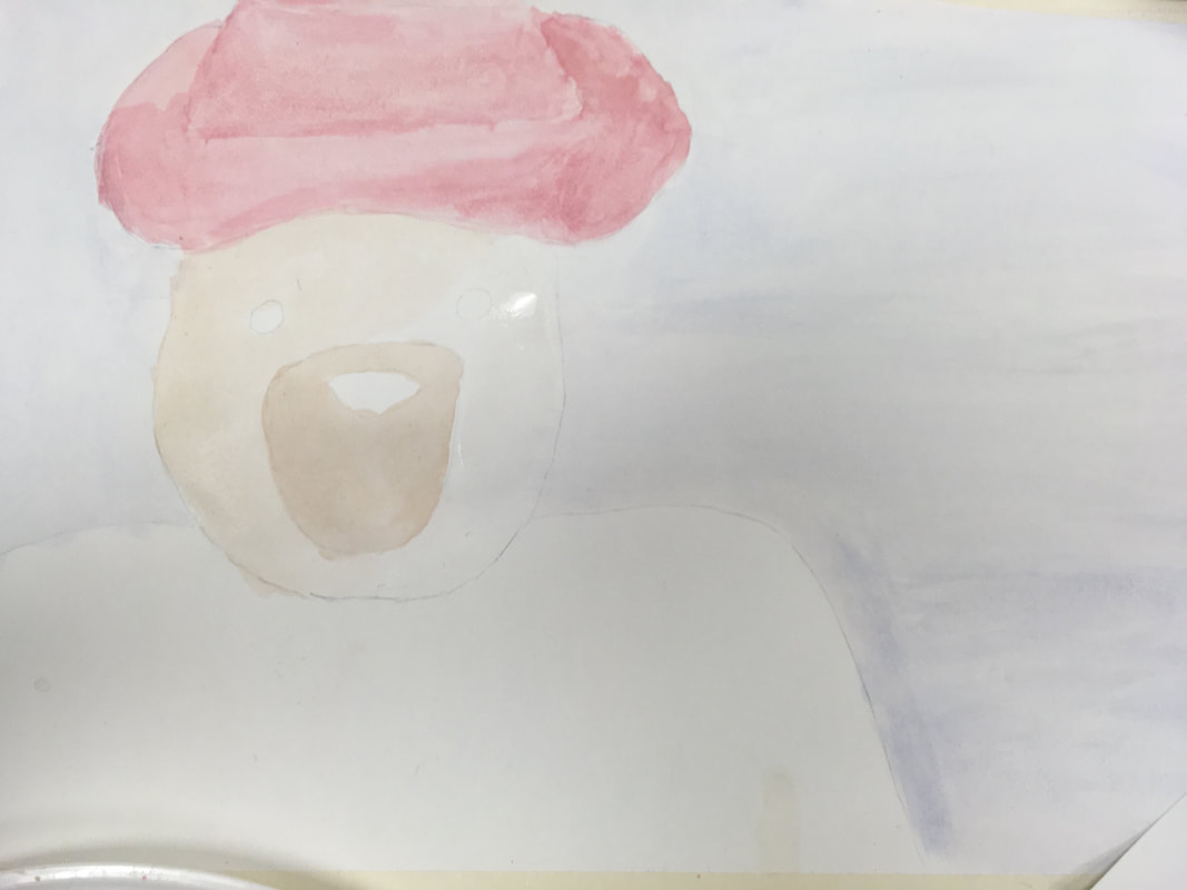 1. I choose to recreate Paddington Bear.
2. I choose to make mine different by making him look more like a stuffed animal bear, instead of more realistic like in the movies and books. 3.First I choose that I was going to make Paddington, and tried to sketch a picture of how I could make him differ. Then I make a detailed sketch and painted it too. After that I spent a long time making the colors I knew I needed. Finally I painted and finished the project. 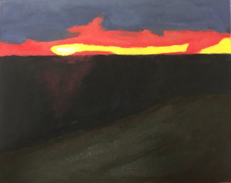
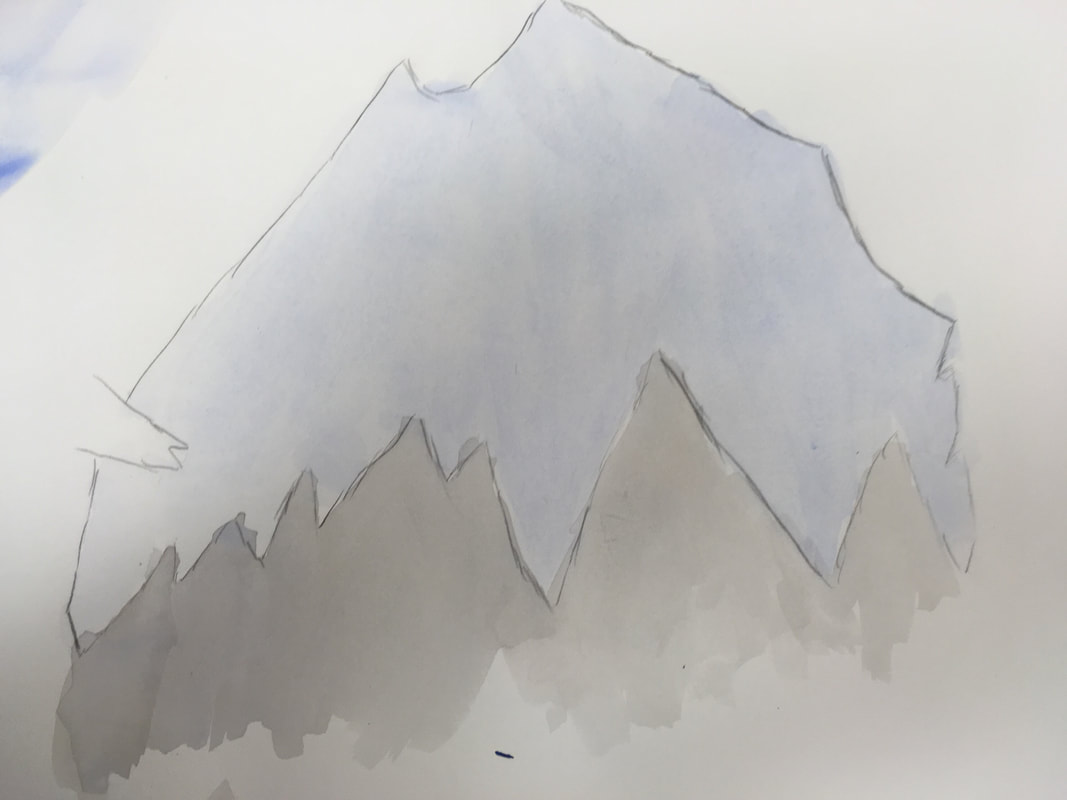
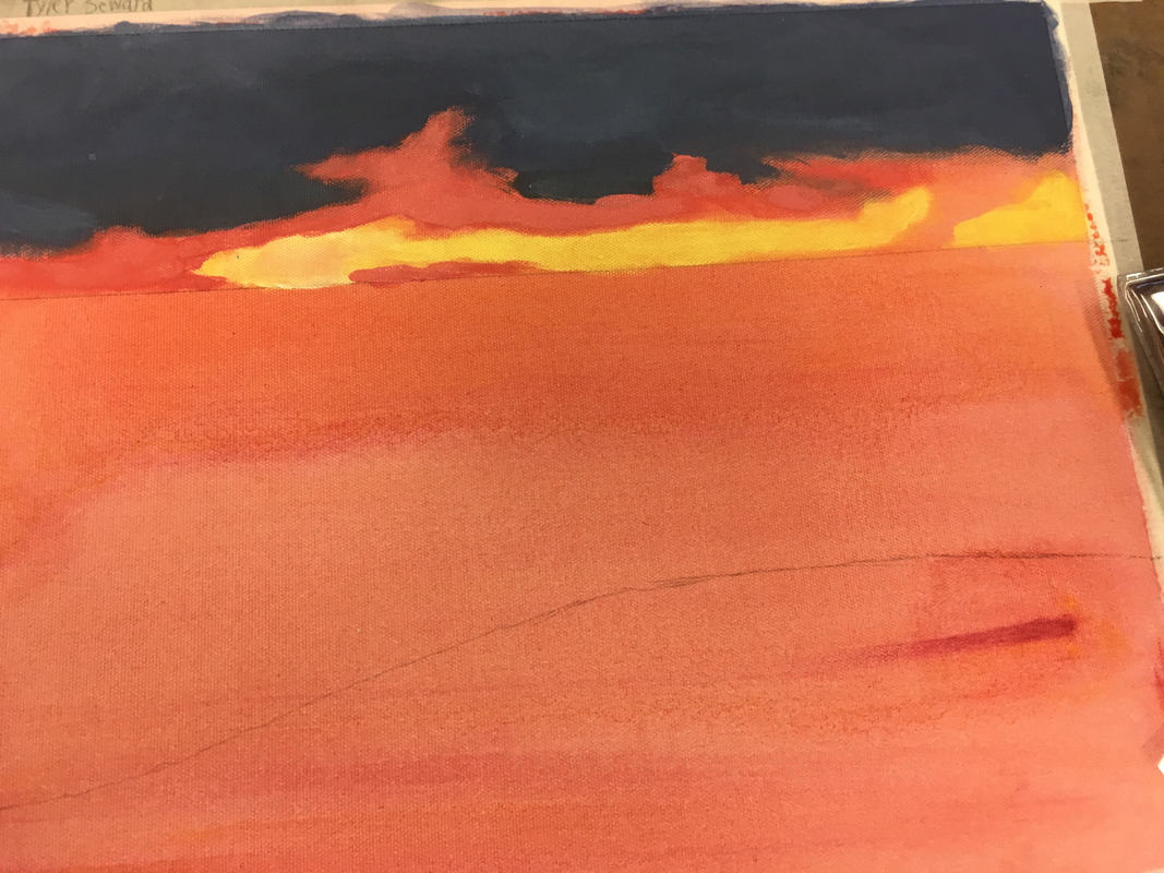 My painting represents my grandparents cottage on Lake Michigan. This is important to me because I have gone there since I was three years old and my family has owned this land since the 1920’s.
The most challenging part of this painting was combining colors to make that pink-orange color for the sunset. I feel that the reflection of the sun off the water was my most successful part of my piece. First I had to choose a picture that was about my grandparents cottage. I choose this sunset because of the bright colors. Then I sketched it and tried out colors. Next the I started on the clouds with a blue and grey mix, then I painted the sunset with a pinkish orange mix and a white and yellow mix. After that I painted a pink-orange triangle, and painted black and blue water over it. Next I used the fur method to paint the dunes with brown and dark green. Finally I used a very small brush to touch up and add extra layers in areas.
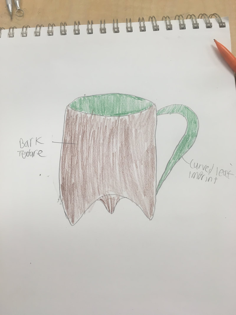
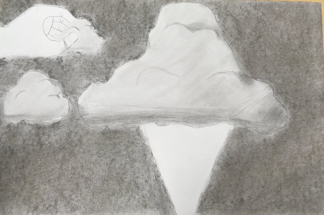
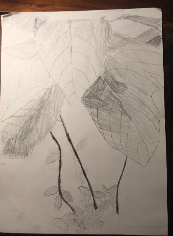
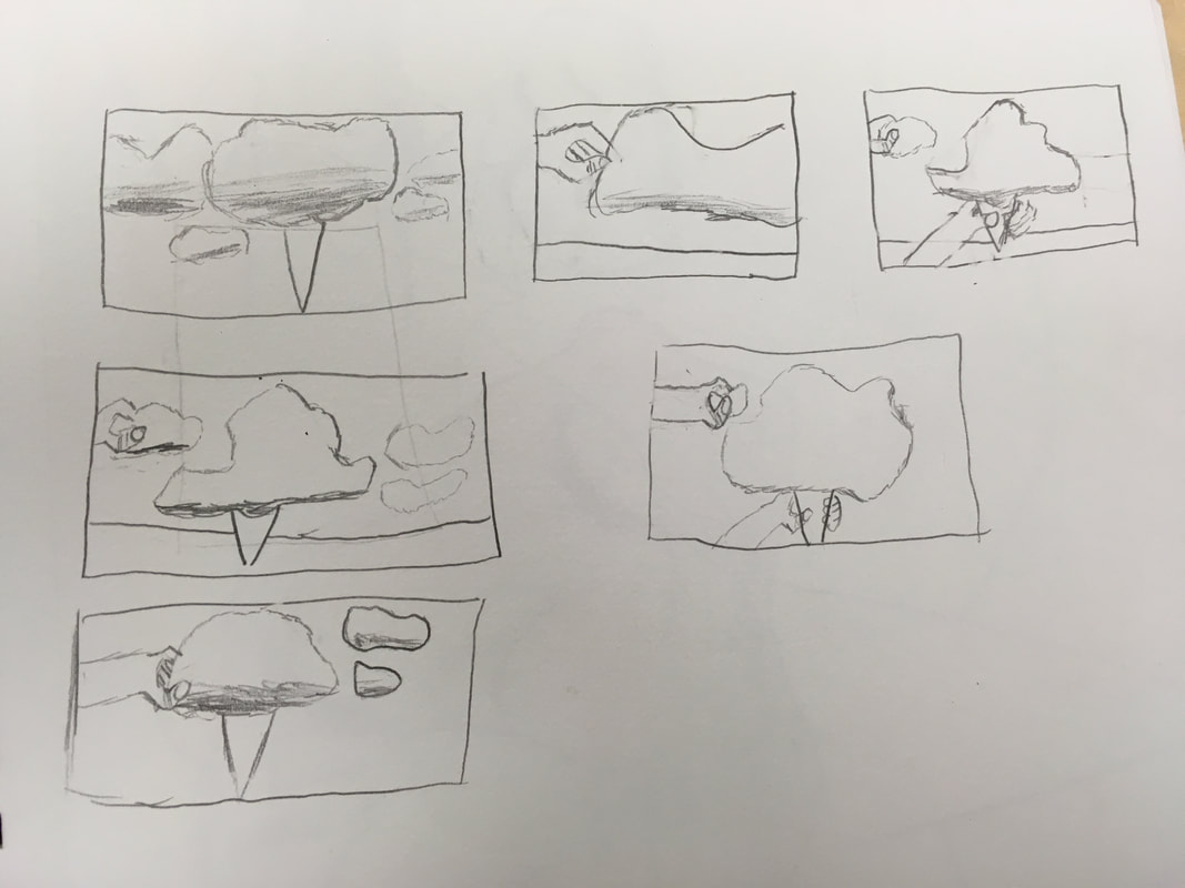
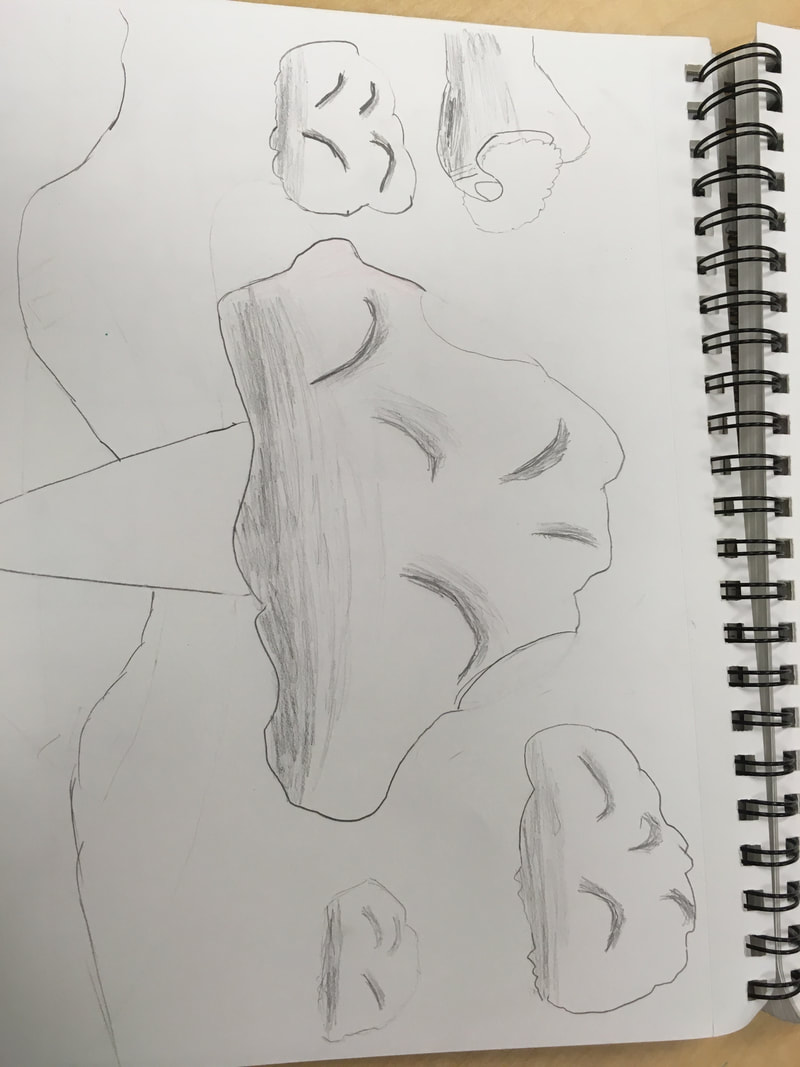
 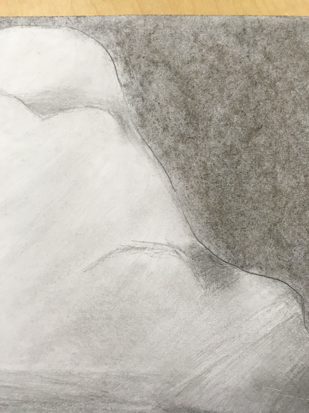 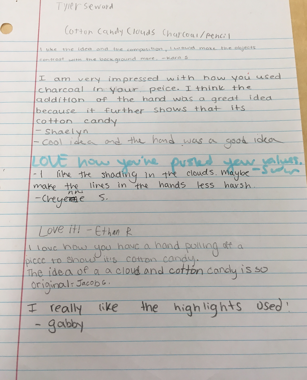 1. The medium that I choose was pencil and charcoal because clouds do not have a whole lot of color or at least the ones I thought of, and I choose charcoal to lighten up the clouds value. I choose to leave the hand and cone white to show that they are somewhat of imaginary objects in the picture.
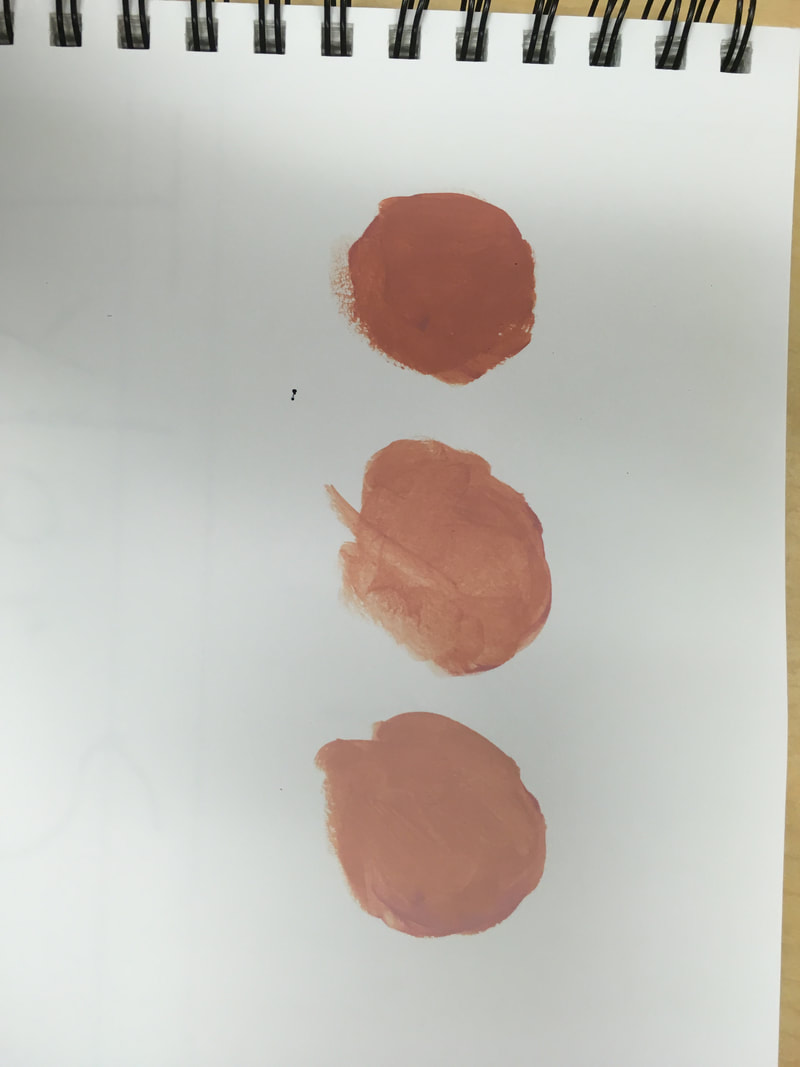
2.The two things I added in my two in one project are cotton candy and clouds. The clouds are kind of obvious but I show the cotton candy by the cone and the hand picking a piece. 3. First I wrote 20 ideas down, one of them was clouds, and all I had to think was what might go with clouds. After that I drew the simple thumbnail sketches and decided to go with the design I have above. From there I drew my sketch in pencil and finalized my plan. Finally I started drawing the clouds after I had the clouds, hand, and cone drawn I gave the clouds value with a pencil. But I couldn't decide on a background until I realized that I needed to lighten up the clouds without losing value so I decided to make it a darker background. Then after all this I was able to call it complete. 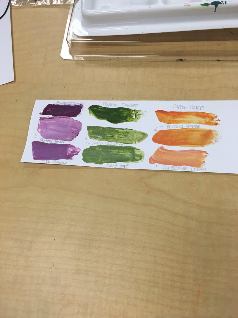 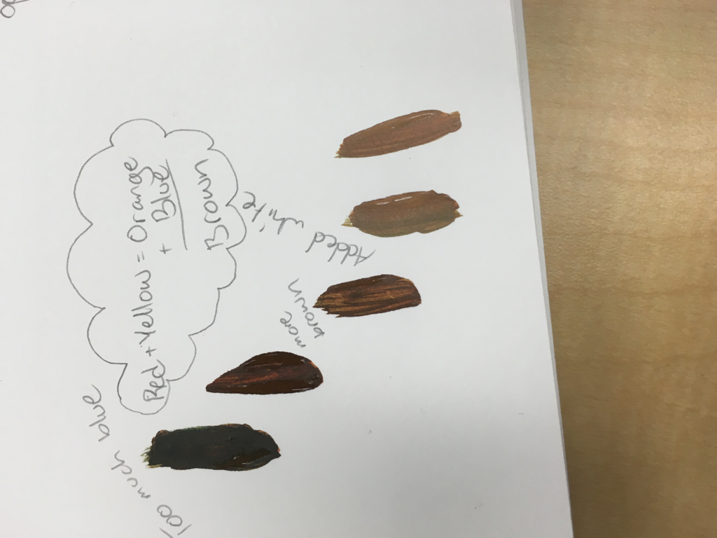 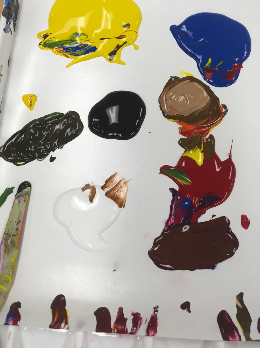 What I have learned from this activity is that colors are very sensitive to changes. Also that you can make any color by just mixing the primary colors together with black and white added in.
You make brown by mixing all primary's together or by mixing complementary colors together. 1. My mentors Name is Shaelyn Khoury, she is a Senior.
2. Shaelyn loves photography, and her favorite thing to photograph is the sky. 3. shaelyn-apex-2018.weebly.com/ 4. I think I will get some good Input on my pieces and information on how to become a better artist. I hope to get some good tips on how to succeed in this class.  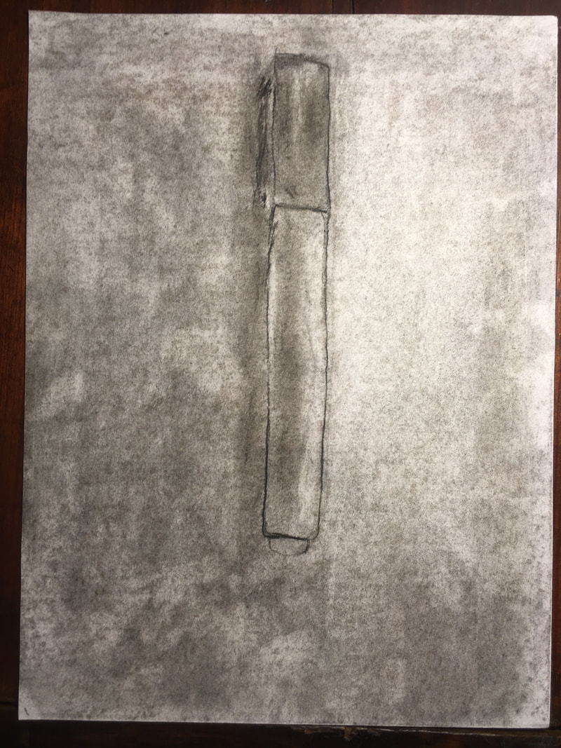 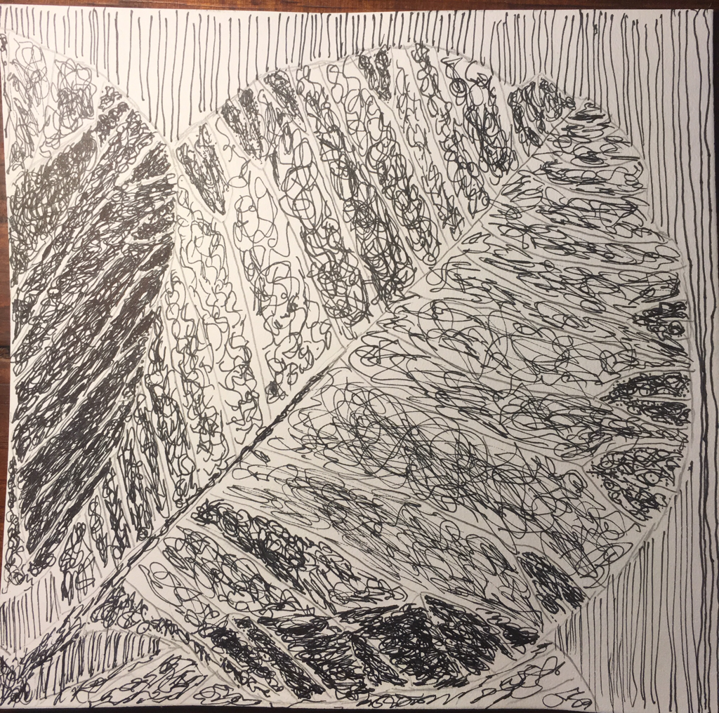 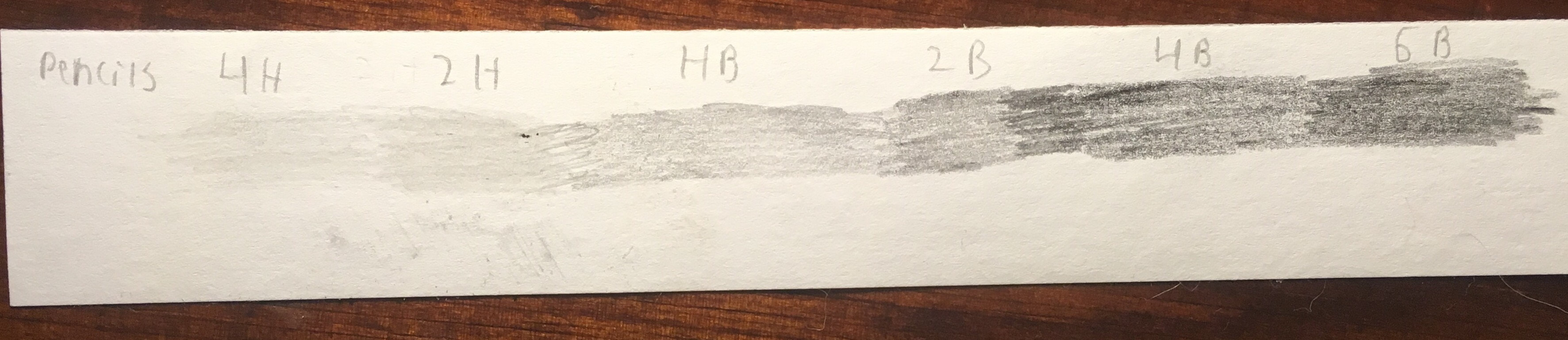 1) The most helpful warm up this unit to me was the value scale because I did not know how in depth you could get in to the darker and lighter colors, this also shows me how drastic you can make value in a pencil drawing.
2)Composition is the arrangement of visual attributes in a work of art, as distinct from the subject. Value is an element of design that defines the light's and dark's in artwork. 3)The pro of pencil is that it can easily be erased, but the con are that you can't add as much value and depth. The pro of pen is that the artist can make it almost realistic, the con are that it can't be erased at all. The pro of charcoal is that it easily blends mistakes, the con of charcoal is that it smudges very easily. 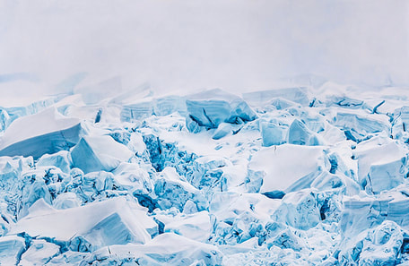 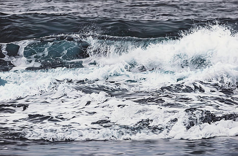 Zaria Forman, drew these two pieces with pastel, one is frozen tundra of Antarctica the other is waves rolling in Hawaii. She was born in South Natick, Massachusetts but currently works in Brooklyn, New York, she studied at the Studio Art Centers International in Florence, Italy. The thing about her artwork that inspires me is the motion without any motion, like the waves she works the pastels in such a way to make them look like they are moving. What draws me to her work is how realistic it is, when I first saw the Antarctica piece I thought it was a photograph, this truly amazes me.
|
AuthorWrite something about yourself. No need to be fancy, just an overview. Archives
August 2018
Categories |
 RSS Feed
