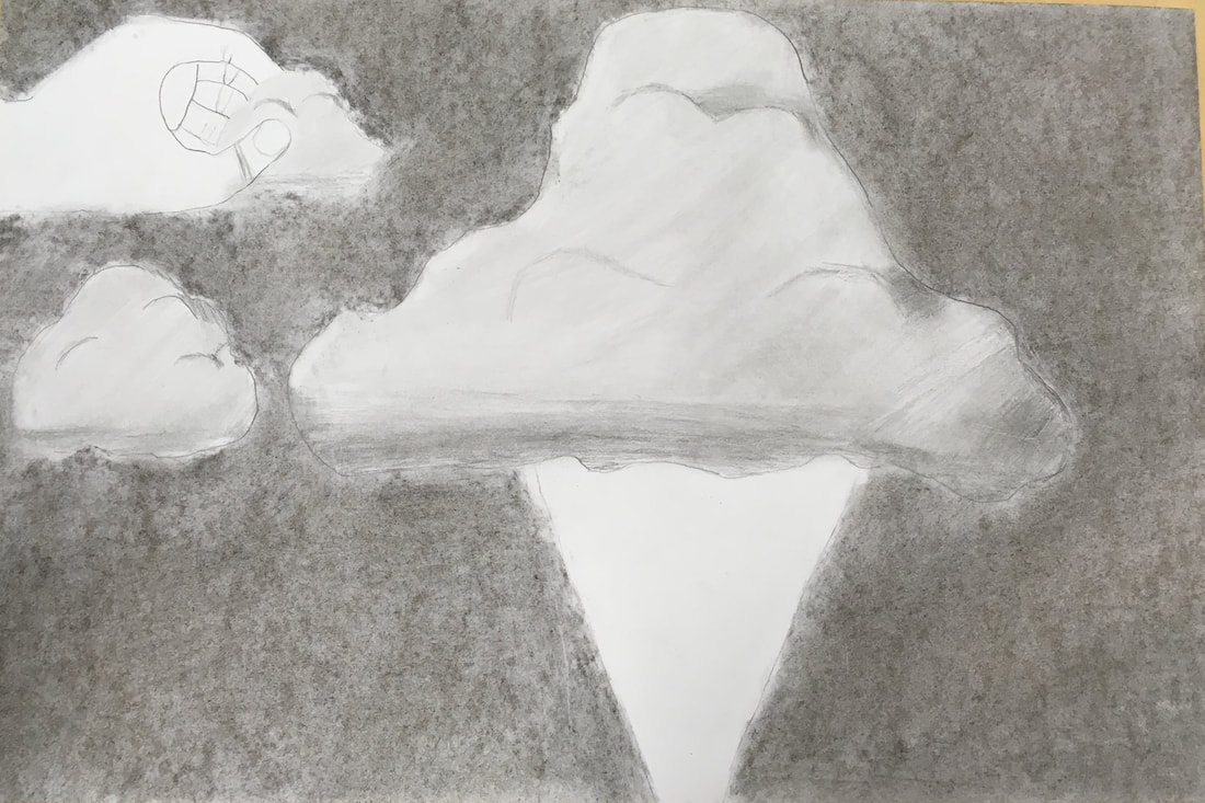
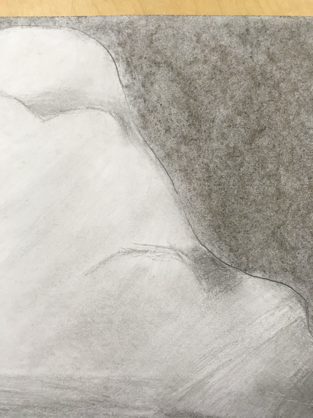
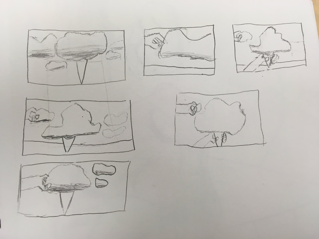
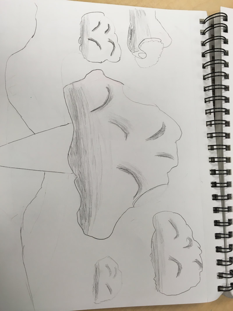
   1. The medium that I choose was pencil and charcoal because clouds do not have a whole lot of color or at least the ones I thought of, and I choose charcoal to lighten up the clouds value. I choose to leave the hand and cone white to show that they are somewhat of imaginary objects in the picture.
2.The two things I added in my two in one project are cotton candy and clouds. The clouds are kind of obvious but I show the cotton candy by the cone and the hand picking a piece. 3. First I wrote 20 ideas down, one of them was clouds, and all I had to think was what might go with clouds. After that I drew the simple thumbnail sketches and decided to go with the design I have above. From there I drew my sketch in pencil and finalized my plan. Finally I started drawing the clouds after I had the clouds, hand, and cone drawn I gave the clouds value with a pencil. But I couldn't decide on a background until I realized that I needed to lighten up the clouds without losing value so I decided to make it a darker background. Then after all this I was able to call it complete.
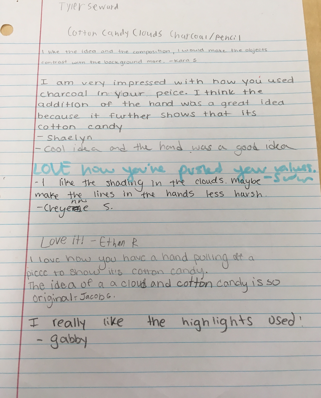
0 Comments
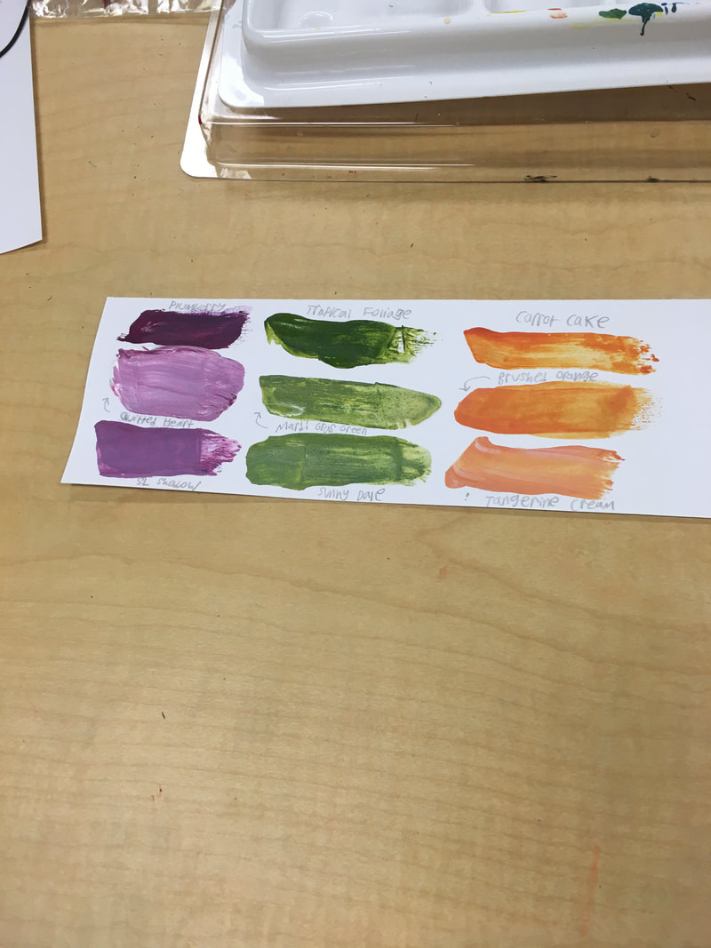 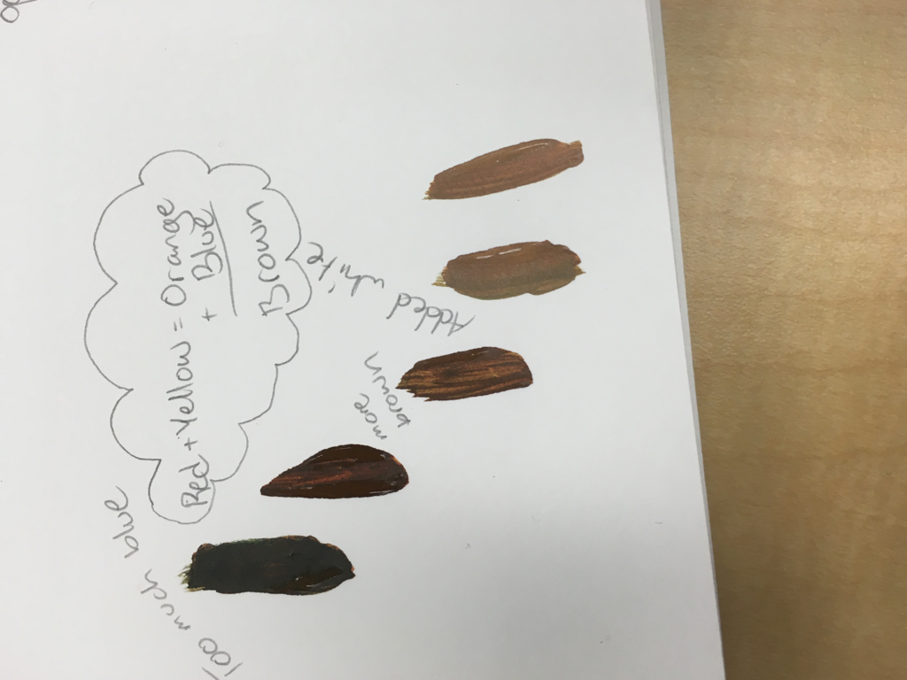 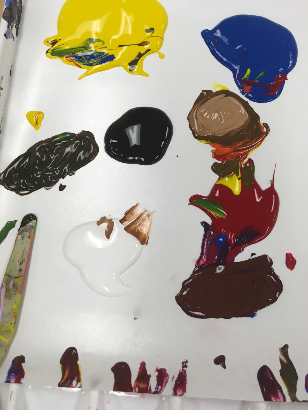 What I have learned from this activity is that colors are very sensitive to changes. Also that you can make any color by just mixing the primary colors together with black and white added in.
You make brown by mixing all primary's together or by mixing complementary colors together. 1. My mentors Name is Shaelyn Khoury, she is a Senior.
2. Shaelyn loves photography, and her favorite thing to photograph is the sky. 3. shaelyn-apex-2018.weebly.com/ 4. I think I will get some good Input on my pieces and information on how to become a better artist. I hope to get some good tips on how to succeed in this class.   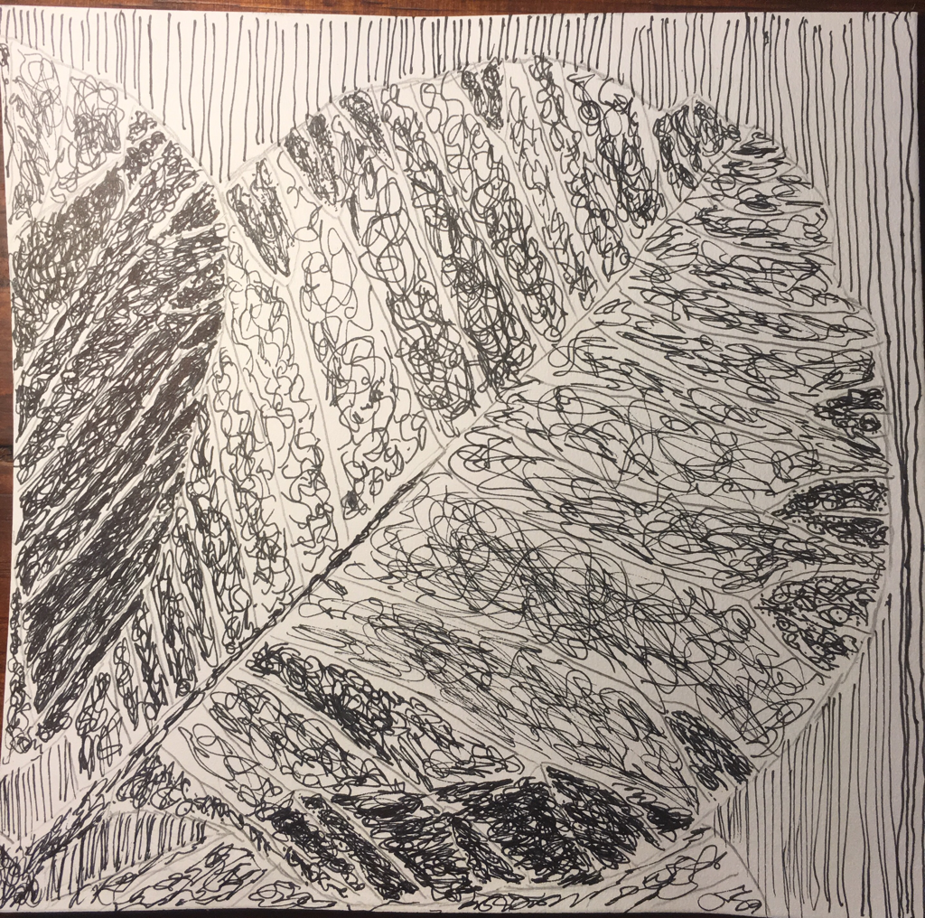 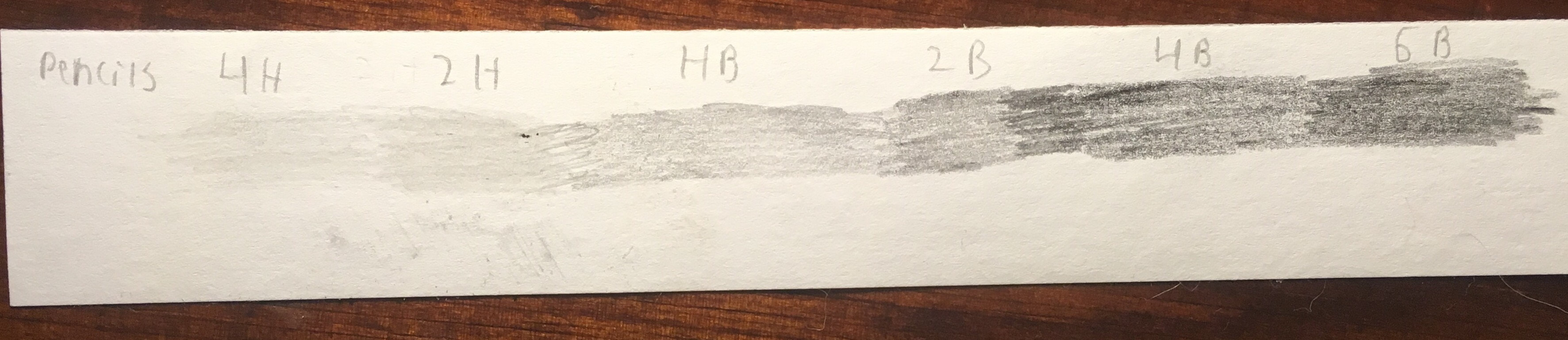 1) The most helpful warm up this unit to me was the value scale because I did not know how in depth you could get in to the darker and lighter colors, this also shows me how drastic you can make value in a pencil drawing.
2)Composition is the arrangement of visual attributes in a work of art, as distinct from the subject. Value is an element of design that defines the light's and dark's in artwork. 3)The pro of pencil is that it can easily be erased, but the con are that you can't add as much value and depth. The pro of pen is that the artist can make it almost realistic, the con are that it can't be erased at all. The pro of charcoal is that it easily blends mistakes, the con of charcoal is that it smudges very easily. 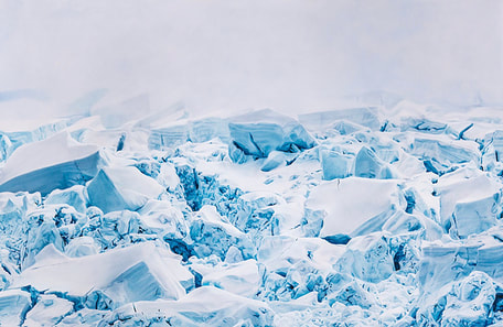 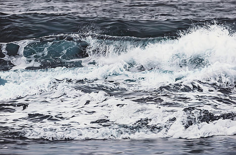 Zaria Forman, drew these two pieces with pastel, one is frozen tundra of Antarctica the other is waves rolling in Hawaii. She was born in South Natick, Massachusetts but currently works in Brooklyn, New York, she studied at the Studio Art Centers International in Florence, Italy. The thing about her artwork that inspires me is the motion without any motion, like the waves she works the pastels in such a way to make them look like they are moving. What draws me to her work is how realistic it is, when I first saw the Antarctica piece I thought it was a photograph, this truly amazes me.
|
AuthorWrite something about yourself. No need to be fancy, just an overview. Archives
August 2018
Categories |
 RSS Feed
